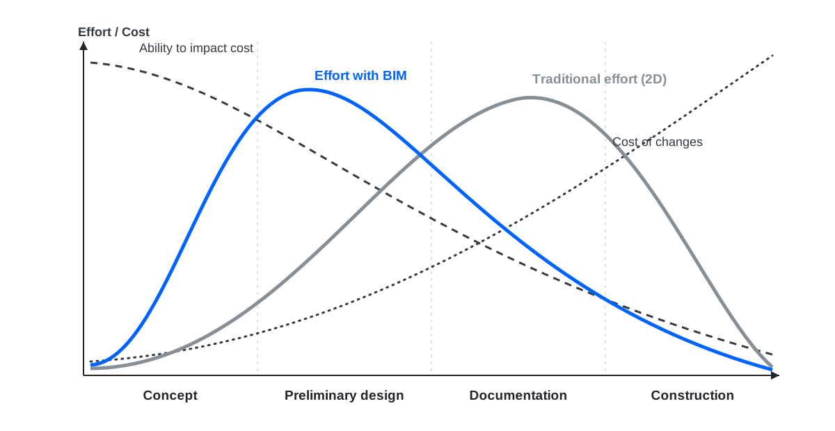
Around 2004, Patrick MacLeamy, then CEO of HOK, one of the largest architecture firms in the world, drew a graph that has been projected in BIM presentations ever since. It contains no software, no technology, no acronyms. Just four curves on two axes: project time horizontally, effort and cost vertically. And it explains, better than any brochure, where construction projects lose their money.
If you work in this industry and have never had the curve properly explained, this post is for you.
The four lines
Line 1: your ability to impact cost. At the concept stage, almost every decision is still open: structural system, materials, floor-to-floor heights, the routing of every major duct. Changing any of them costs a conversation. As the project advances, decisions freeze one by one, and each frozen decision drags others with it. By the time construction starts, your power to improve the project's economics is close to zero. This line starts high and falls.
Line 2: the cost of making changes. A mirror image. Moving a shaft in a sketch costs nothing. Moving it in coordinated documentation costs redrawing across three disciplines. Moving it on site costs demolition, rework, claims and delay. This line starts near zero and climbs steeply, and it never stops climbing.
Line 3: where traditional workflows spend their effort. Here is the uncomfortable one. In a classic 2D process, the peak of human effort lands late, during construction documentation, exactly where line 1 says you can no longer improve much and line 2 says every discovery is already expensive. Why? Because 2D documentation is labor: hundreds of sheets drawn and cross-checked by hand, and the labor naturally piles up at the end.
Line 4: where the effort should be. MacLeamy's argument is simple: shift the peak left. Spend the intense hours during concept and preliminary design, when decisions are cheap to change and their impact is enormous. The total effort doesn't necessarily grow. It moves.
The whole curve is one sentence: the cheapest moment to solve a problem is before it exists, and traditional workflows systematically arrive after it.
What this looks like in real money
A case from our own experience. Foundation reinforcement drawings were being rushed out the door: the client pushed the deadline, the review stage got compressed, and the sheets were issued "to keep the schedule". An error slipped through.
By the time it surfaced, the foundations were already poured. The fix on site: post-installed rebar, drilling into hardened concrete and setting bars with Hilti chemical anchors, splice by splice, with testing and back-and-forth approvals on top. Final cost of the repair: about three times what the correct reinforcement would have cost done in proper sequence. And that's counting only the direct work, not the stopped work front, not the endless rounds of rework, not the schedule that slipped anyway, the very schedule the rushed issue was supposed to protect.
Put that story on the curve and it maps perfectly. The error was born on the left side, where catching it was a review cycle: days, and a conversation. It was discovered on the right side, where line 2 had already tripled the price. The deadline pressure that caused the rushed issue saved perhaps a week on paper and paid it back at 300%, with interest, in concrete.
Multiply that by the hundreds of decisions in any real building, and you have the gap between projects that finish on budget and projects that finish in arbitration.
What the curve does NOT say
Here's where most presentations stop, and where honesty should start.
It's a concept, not a dataset. MacLeamy drew an idea, not measured results. The exact shape varies by project type and contract. Treat it as a mental model, not a formula.
Shifting effort left is not free. Someone must pay for senior engineers thinking hard in month one, when fee structures in most contracts, especially public ones, pay for delivered documents, not for prevented problems. The curve describes what's rational for the project; our fee structures often reward the opposite. That contradiction, not technology, is the real barrier.
Software doesn't shift the curve by itself. You can model in 3D and still make every important decision late. BIM is what makes the shift possible, a model lets you test, coordinate and price decisions early, while they're still cheap. But the shift itself is a management decision: budgeting real hours, with real seniors, at the stage where the curve says they matter.
The question to take away
Look at your current project and ask one thing: in which month did the people with the most experience spend the most hours?
If the honest answer is "during documentation, fixing things", the MacLeamy curve isn't theory for you. It's your cost structure, drawn in advance, twenty years ago, by someone who saw exactly how this ends.